UI-UX | UX Research | FMCG | App Design | Visual Design
Overview
Amplepac founded by Arpita Kalanuria is an innovative AI and Blockchain platform dedicated to facilitating the packaging, return, and reuse of items within the FMCG (Fast-Moving Consumer Goods) sector.
Amplepac introduced new application for their users – India Reuse, designed to streamline and optimize these processes by providing real-time tracking, live timestamps, and a separate interface for each stakeholder involved in the product lifecycle.
My role as the UX designer involved understanding the unique requirements of each user type and designing an intuitive, user-friendly interface that addressed their specific needs. This case study details the UX research and design process, highlighting the strategies and methodologies employed to enhance the user experience for Amplepac’s India Reuse mobile application.
Tools Used:
Figma | FigJam | Illustrator
Client:
Arpita Kalanuria(CEO, AmplePac)
Sandeep Agrawal(Developer, InventLabs)
CONTEXT
Creating an effective application that addresses the diverse needs of various stakeholders—internal members, manufacturers, logistics, and retailers—poses significant challenges.
The application needs to incorporate features such as real-time tracking, live timestamps, user-specific interfaces, easy login, supply chain optimization, visual data representation, multi-language support, direct consumer communication, and payment gateway integration.
Requirements
Requirements were gathered from the Amplepac team to move forward and create a significant impact in the FMCG industry.
MAin Vision
By enhancing transparency, efficiency, and communication throughout the end to end product lifecycle, we aim to promote sustainability and innovation. Following are some key points of focus while designing.
Different Users requirements
The application serves four main types of users, each with unique needs and interfaces:
- Internal Members: Oversee and manage the entire process.
- Manufacturers: Monitor production and packaging.
- Logistics: Handle the transportation and delivery of items.
- Retailers: Track the arrival and return of goods.
RESEARCH
Client INTERVIEW
To gain a comprehensive understanding of the product requirements for Amplepac’s India Reuse mobile application through in-depth discussions with key stakeholders.
This will ensure the application meets the diverse needs of all users and aligns with Amplepac’s goals.
The client interview provided comprehensive insights into the diverse needs and expectations of all user types for the India Reuse mobile application.
User Persona
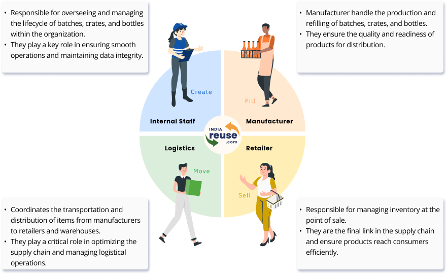
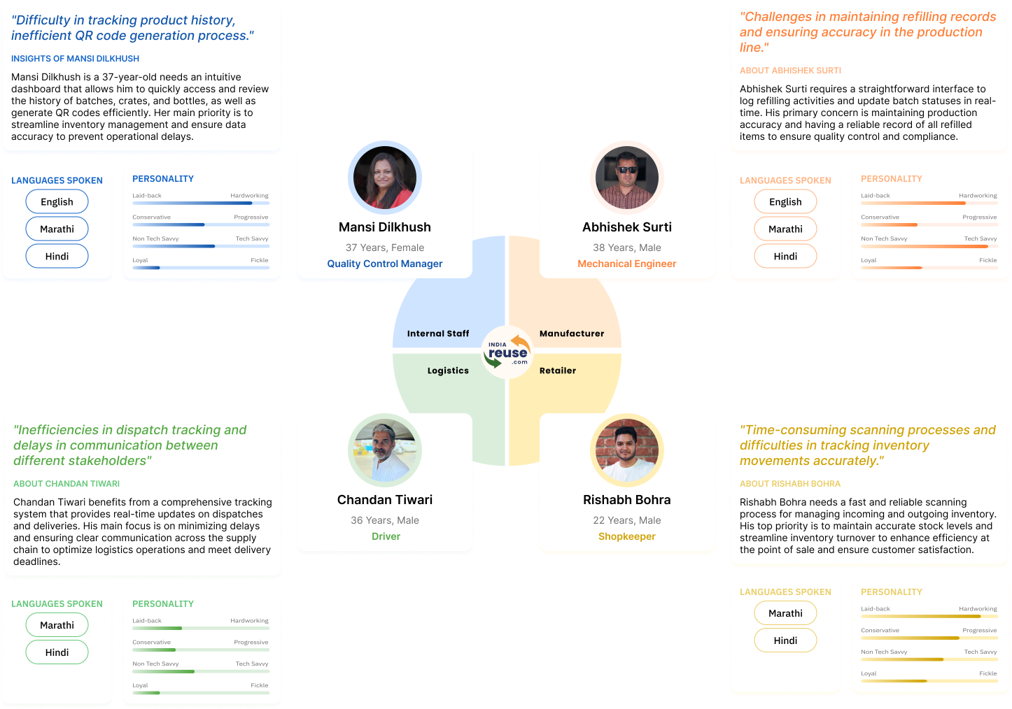
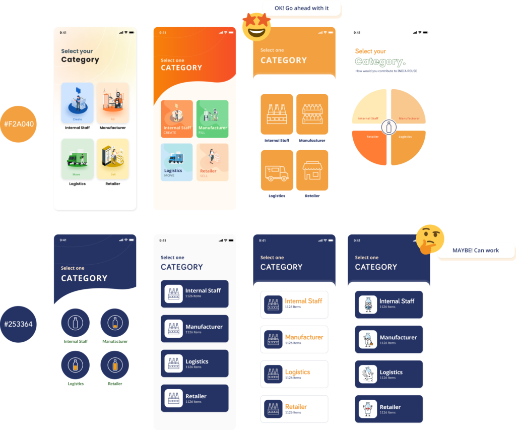
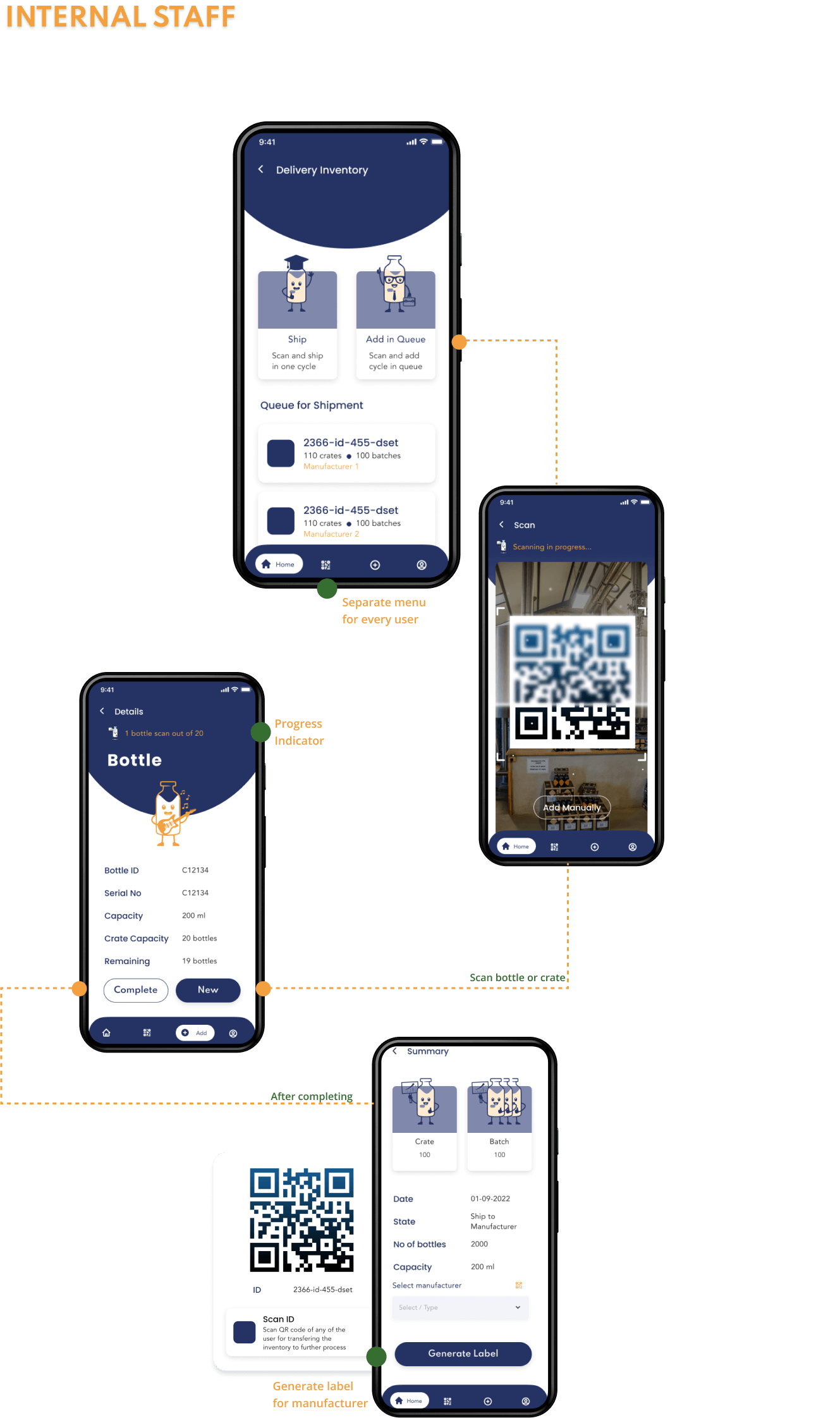
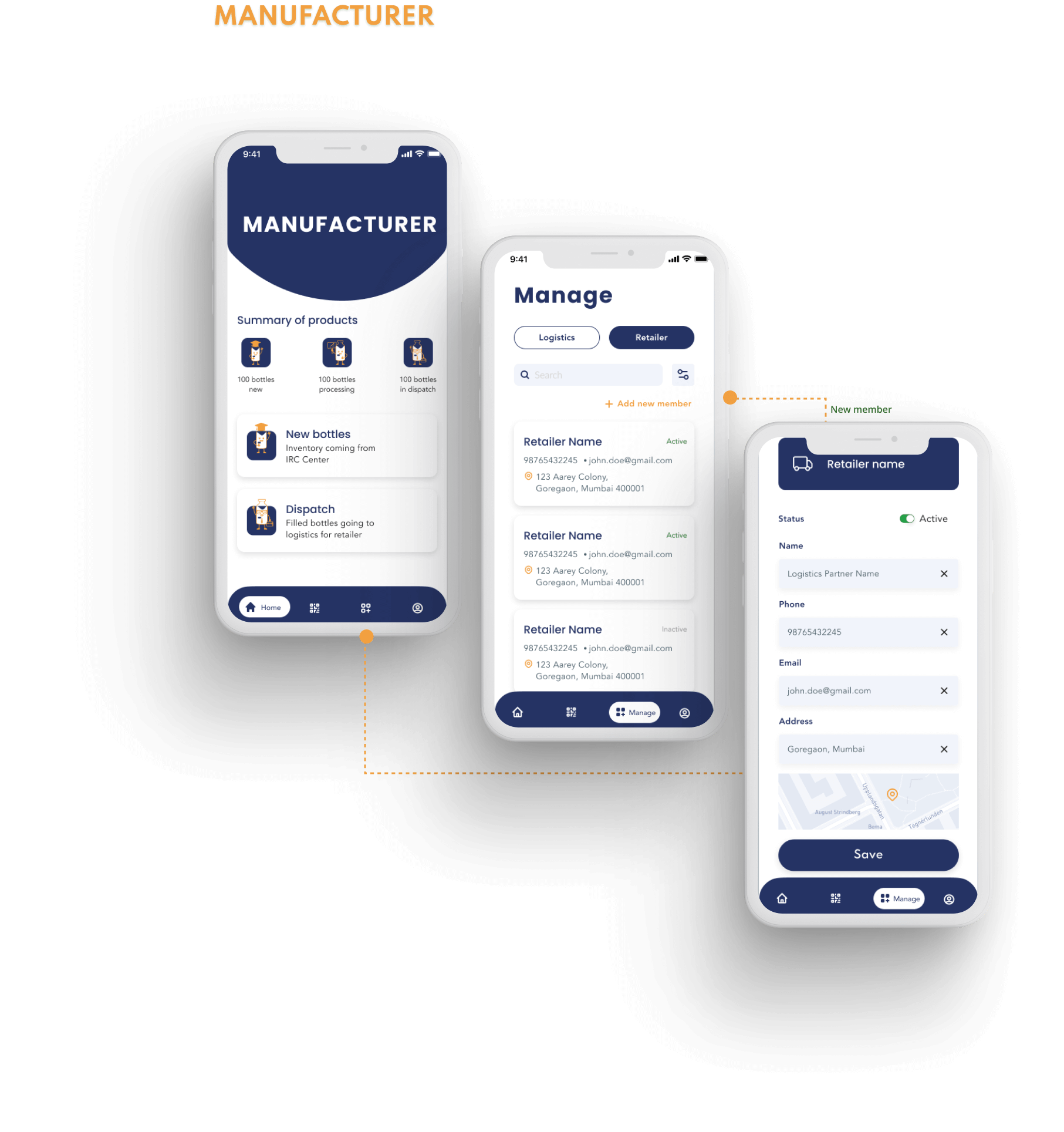
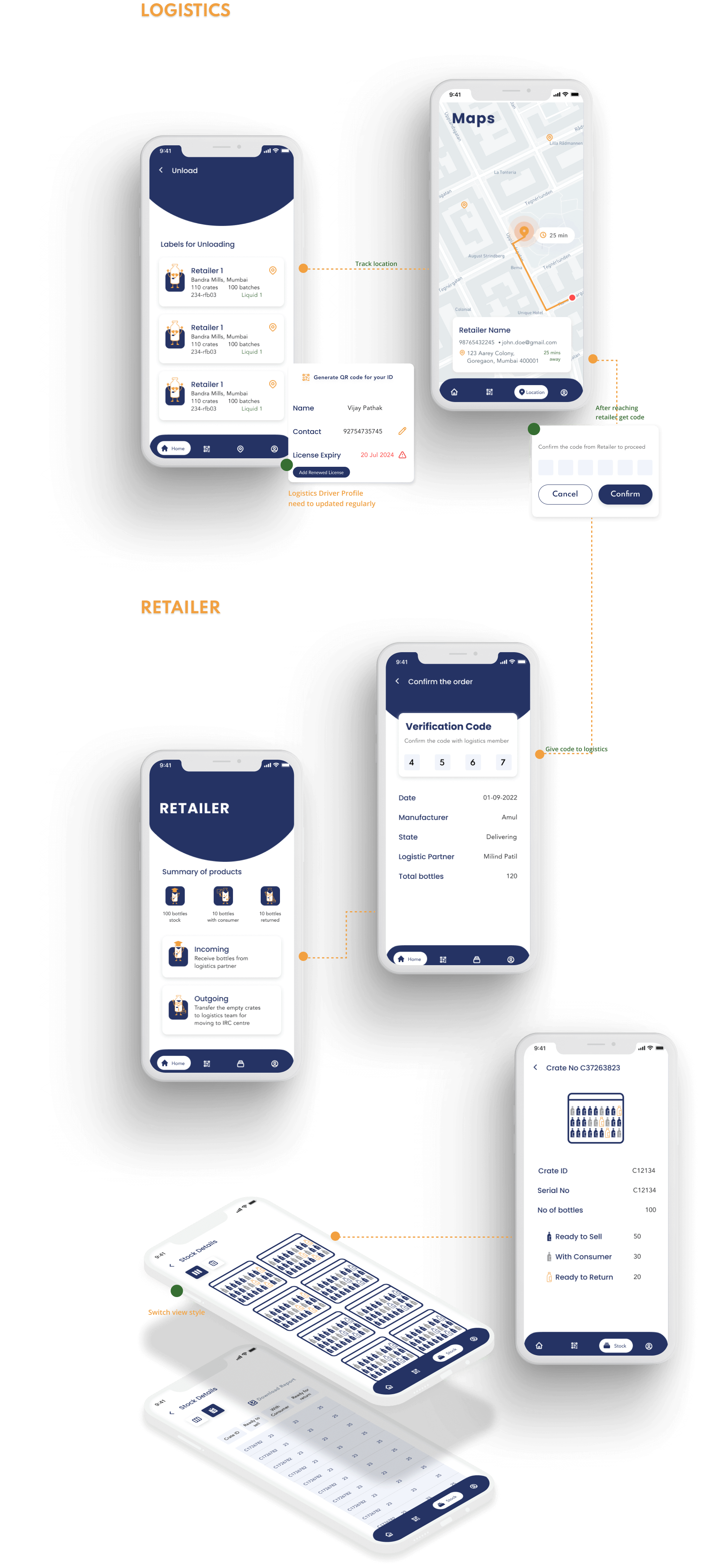
After gathering all the answers from the interview, we created user-specific personas for each user type to understand their needs, behaviors, and expectations.
These personas provide insights into the unique requirements of Internal Staff, Manufacturers, Logistics, and Retailers, guiding the design process to ensure the application meets the diverse needs of all stakeholders.
Product Lifecycle
Based on our research, we created a product lifecycle flowchart to gain a clear understanding of each user role and their interrelationships.
This flowchart illustrates how internal staff, manufacturers, logistics, and retailers interact within the system, highlighting their specific responsibilities and how they collaborate to ensure the smooth operation of the application.
USER Journey Flow
rom the product lifecycle, we developed individual user journey maps within the application. These maps detail the specific steps and interactions for each user type, providing a clear visualization of their experiences and highlighting key touchpoints and pain points
WIREFRAMES
Initial wireframes were created based on the user flow, providing a visual blueprint of the application’s structure and key interactions for each user type.
Iterations
The visual challenge was to incorporate the color composition from the India Reuse logo. We presented several color scheme options to the client, ensuring they aligned with the brand identity. After a thorough review, the client finalized an initial color primary color.
Visual Scheme
Using this primary color, we designed the screens, carefully selecting typography, icons, and other visual elements to establish a cohesive visual language that would enhance user experience and brand recognition.
However, after reviewing the almost complete set of screen designs, the client requested changes to the color scheme and overall visual language. They sought a more calm and professional aesthetic to better reflect the innovative and forward-thinking nature of the application.
VISUAL IDENTITY
In response, we revisited the design, incorporating the new color palette and visual elements.
UI DESIGN
We continuously changed our design according to the feedback from our to meet every users touchpoint.
Check out all the wireframes and final screens on figma.
CONclusion
The development of Amplepac’s India Reuse mobile application marked a significant step for the startup, which focuses on sustainability. This new application was designed from the ground up to meet the specific needs of different user roles, enhancing efficiency and user satisfaction through a user-centric approach.
Looking ahead, there is potential to expand the application’s scope by developing a consumer-facing app, further strengthening Amplepac’s market presence. Additionally, the integration of real-time product images, provided by the client, will replace the current icons, offering users a more realistic and engaging experience.